Im also taking environmental science which surprisingly turned out to be a fun and interesting class. I have to confess that before I took this course, I was the most un-environmentally friendly person ever. I couldn't care less about going green and I loved my plastic bags. I only took this course because I couldn't fit anything else into my schedule. This course definitely changed my mindset on the environment...and now I finally believe that the world may come to an end. Anyway, good to know I am no longer a disgrace to Oregonians.
Character design class is definitely one of my favorite courses. Even though I still suck at drawing without reference, I've definitely improved a good deal within these last 1-2 years (since I started college). Since awhile ago, I've secretly dreamed of becoming a character designer (next to toy designing). Currently, my skills are nowhere near the professional level, but its probably an attainable goal if I keep working hard. Anyway, this class is extremely fun. Seeing everyone else's work and style, getting productive criticism, being taught by a great instructor, understanding what makes a 'good' character design. I really enjoy the challenge because character designing isn't just about drawing an appealing character, you have to understand and take note of every little trait and detail about your character. If your character is lazy, how will he/she stand? How will they dress? What would their normal expression look like, etc. Its a process of bringing life to written character.
My fourth class is lighting and texture. Maya is still the most annoying program I've ever used, its a sad thing to say because I will probably be using it for the rest of my life. Before taking this course, I knew that I was a little 'lighting-challenged'. I just can't seem to understand whats good and whats bad lighting. Well im still lighting-challenged, but I'd like to believe im slowly grasping it. Texturing im okay with...except right now we're learning how to do UV unwraps and I am still slightly..or very clueless.
Next term im taking character sculpting (omg im so excited), intermediate 3d modeling, art history 206, background design & layout, and an online writing course (will be my first online-course experience).
And finally....on with pictures!
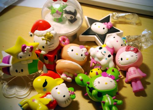
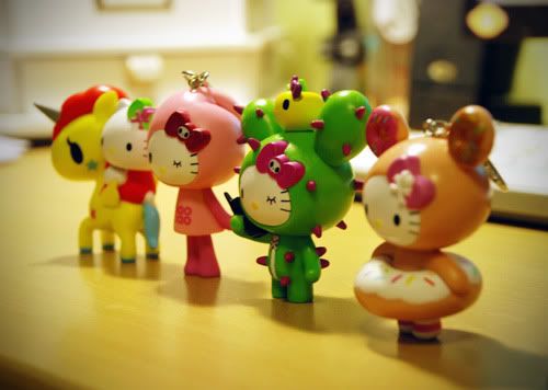
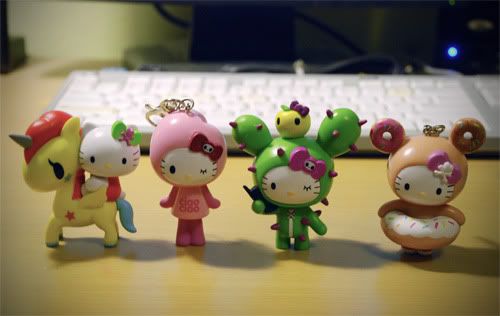
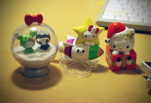
SO POOP-MY-PANTS-HAPPY!! I asked my cousin in HK if she could get me one or two of these TokiDoki x Hello Kitty figures from HK 7-11's and she actually got me the whole set!! She knew somebody who worked at 7-11 and they got me the whole first series without having to get stamps. Me so lucky!!
Nice picture huh? I used my cousins Nikon D80 =P he let me borrow the camera for work purposes.
My favorite four!! The donut one is my favorite but she can't stand on her own (i added sculpey to her foot).
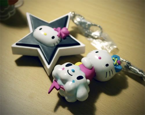
The thunder on the cloud broke =( but its okay.
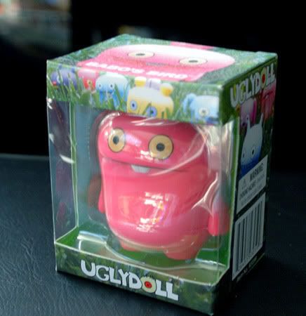
Went back to Toys R Us before the sale ended and bought another Uglydoll fig.
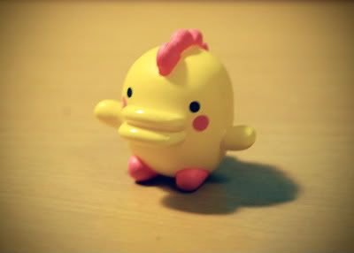
Some tomagachi toy I bought at Target for like ...50 cents. Brings back good'ol childhood memories.
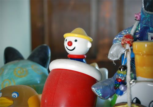
Testing out nikon d80 at home. Strange vintage toy my parents bought years ago. I forgot what they're called, but the legs and the head moves when you hold it horizontally. The camera's quality is so sharp that you can see individual specs of dust...
*suddenly blinds everyone with crap quality picture*
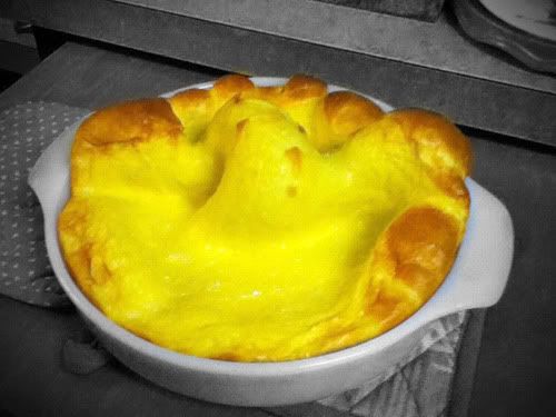
I finally made german pancake!! It turned out delicioussss and it was SUPER easy to make. The best part is watching it rise super high although it deflates when u take it out of the oven. I ate it with condensed milk and whip cream...yummm
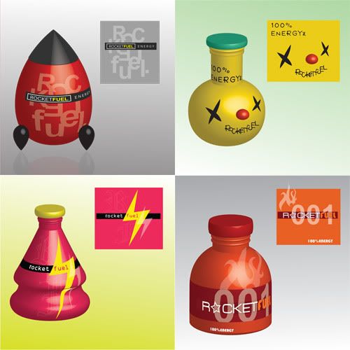
I made these several terms ago for an intro to graphic class. Learned how to make 3d bottles in illustrator. We had to design a label for an energy drink called 'Rocket Fuel' and then map them onto the bottle. I made these at like...2:00 in the morning and pulled an all nighter because they were due at 8:00 (i get ready for school at 6:00). There were actually around 6 designs but the last two turned out terrible...for obvious reasons.
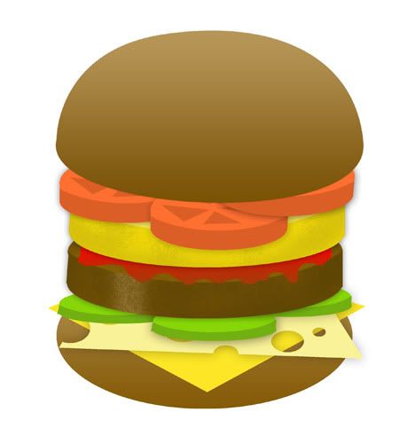
Thought it would be interesting to show a comparison between what kind of drawings you can get when using Photoshop and Illustrator. For years I've been drawing in photoshop cause I didn't know how to use illustrator (thank god I finally learned how. I will never do vector art in PS ever again)
^ top drawing was done in photoshop.
These 3 burgers were done in illustrator. Our instructor made us draw hamburgers on the first day of class. My first time ever using illustrator. Added bacon in the last burger cause... whats a burger without bacon?!
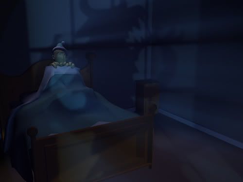
My first lighting assignment for lighting class. Had to model the room and the accessories. Bloke (character) was provided by the instructor. The assignment was to use lighting to express an emotion without changing the characters facial expression. I managed to fix this 45 minutes before it was due because the previous version was SO bad. I spent hours on it and it turned out like crap...it bothered me for the rest of the night/day so I knew I had to fix it. I added the fog and a few more light sources, turned out better. I personally thought it still sucked and could've been more dynamic, but my instructor told me that its one of his favorites o_o *still lighting-challenged*
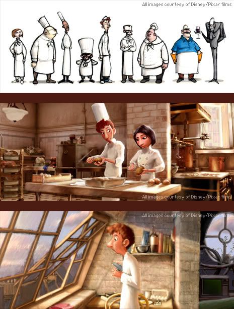
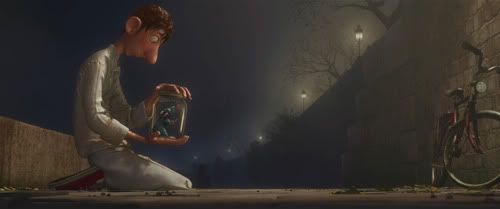
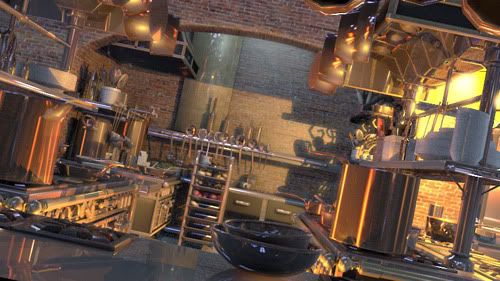
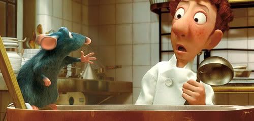
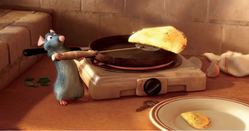
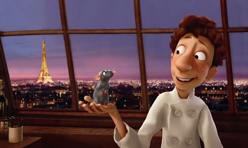
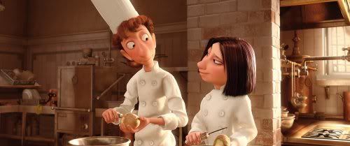
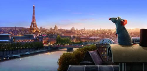
Speaking of lighting, I really wanted to share some pictures from Ratatouille. The character designs AND the lighting were amazing. The lighting in the scenes were done so beautifully. I love the softness and how sunlight spills from the window.
Okay so now I have an idea of what really good lighting looks like...
I really wanna rewatch the movie right now. Probably will do so after this entry.
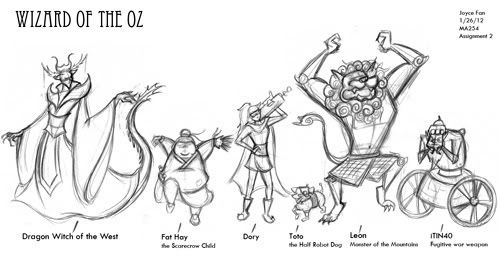
My character line-up sketch for my own version Wizard of Oz (just found out its not called Wizard of "the" Oz...wow ive been calling it that for years). Lots of things need to be redrawn/changed...
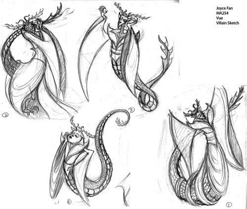
Five sketches of the villainess.
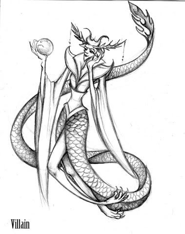
Final concept. My instructor thinks the legs are unnecessary and the head accessories need to be simplified cause there's too much going on. I definitely agree. Im not too happy with the way she came out...looks like the kind of drawing I used to do when I was in middle school or something.
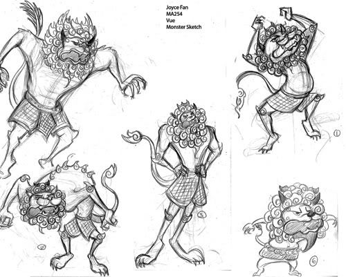
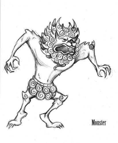
Five sketches for the monster/lion. Inspired by Chinese lion statues.
Final concept. I need to shorten the legs...
I was a bit hesitant about sharing these drawings/sketches because im not too proud of them. We will be working on improving these characters for the rest of the term so it will interesting to see how my final character line up will turn out. My instructor pointed out one VERY interesting thing to me. She pointed to my drawings and said, "Too much twinning! You tend do a lot of that in your drawings.". I found out that twinning is basically drawing poses that are symmetrical. If you cut your drawing in half (vertically), the arms, legs, head should not be completely symmetrical. For example, in my lion drawing...I should've raised or lowered one arm cause right now, they're at the same position. Funny thing is, I've NEVER noticed this in my drawings. I always thought my drawings seemed stiff even though the poses are not straight...now I finally know what the problem is.
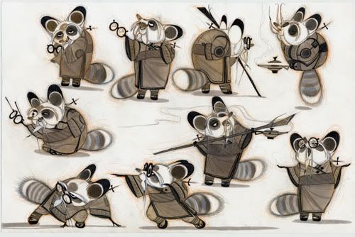
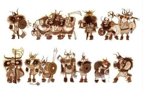
Some VERY awesome character designs from Kung Fu Panda and How to Train a Dragon (I still need to watch this movie). These were done by character designers of those movies. The shapes...the poses...really great designs. Good inspiration for me.
This blog shares more great character designs.
Im so brave for posting my designs alongside these ones =P
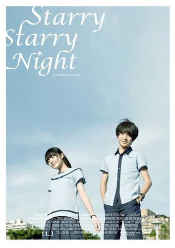
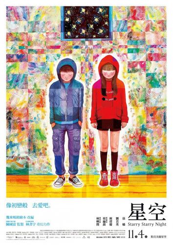
I watched Starry Starry Night, a taiwanese movie based on an illustrated book. Definitely one of my favorite Chinese movies. I really like watching films about coming of age because its such an important and difficult time in life...yet in the end there is always something beautiful that goes a long with it. The cinematography was just BEAUTIFUL. The CG was a bit strange in the beginning, but it worked well with the story. The actor and actress were both great. The storyline was simple but meaningful and deep. The theme song, Starry Night, by Mayday is one of the best songs I've heard in years. Its just a must-watch.
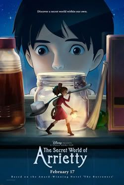
Finally watched Hayao Miyazaki's latest film. The storyline was very simple, but it was a beautiful movie. Since Ponyo was aimed towards kids, Arrietty was definitely aimed towards an older audience. Its another film with coming of age theme and the ending was bittersweet. Spirit Away will still forever remain as my favorite Hayao film though.
During highschool and all the way till my first year in college, I was extremely addicted to reading manga. This year, I've only been following 2-3 mangas. Skip beat and Cheese in the Trap (korean webtoon). I think i've grown out of reading shoujo, I definitely prefer reading josei and slice of life genres. There are rarely anything good to read these days, most of the mangas being scanlated are shoujo or seinen which im not interested in (with the exception of Yankee to Megane san). I believe that a good mangaka is both a good artist AND a good storyteller. Unfortunately, it is very rare to find both qualities in one.
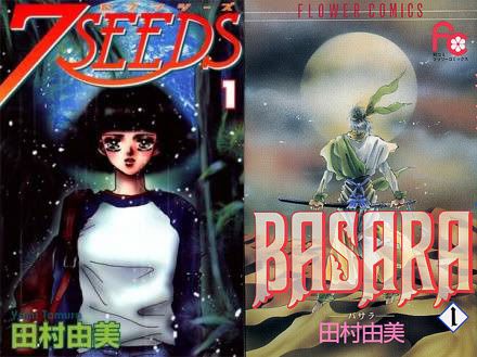
Anyway, I've been a HUGE fan of Yumi Tamura since I read Basara around 2 years ago. Calling it an 'amazing' manga is a complete understatement. I cannot put its epicness and amazingness in words. No exaggeration. After reading Basara, I basically felt like I could stop reading mangas because I know I will never find a better one in this lifetime. Yes, thats how amazing it was. Yumi Tamura makes all the other action/adventure shoujo mangas look like a complete joke.
Her art style takes awhile to get used to. While I was a bit turned off by the art in the beginning, I've become an obsessed fan of her style now. I can't believe the amount of people who thinks her art is 'bad' or just 'okay'. Yes, its different from what most of us are used to...but her art is anything but 'bad'. In fact, i think its beyond good. Besides Soda Masahito, mangaka of Dance Subaru, I don't think I've seen such confident and expressionistic line art from any shoujo mangakas. What makes it amazing is that you can tell she doesn't hire assistants to 'trace' over her sketches like most artists do (not that it makes them any less of an artist), shes so confident and skilled that she just draws as she goes. I definitely think that she puts her story telling alongside the art, sometimes her drawings are sketchy cause she doesnt bother drawing it out with a pencil and then carefully trace over it. In my head, I kind of picture her as this crazy passionate artist who draws straight and fast from what she sees in her head. I think its the rawness / sketchy-ness of her art that makes it come alive.
So anyway, I've recently picked up 7 Seeds again...another epic manga by Tamura. Her storytelling is so good that I think she would've made herself a fine living as a novelist...but shes gifted in both areas so that makes her double times more epic (how many times have I used this word?). 7 Seeds is just as good as Basara, the characters are so well-developed, they all have their distinct personalities, they go through experiences that make them stronger as a team and as an individual. GAH my raving does the manga no justice, its just a must read. The end.
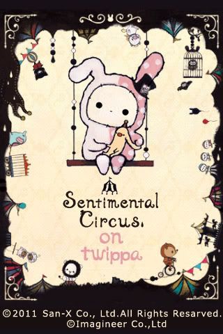
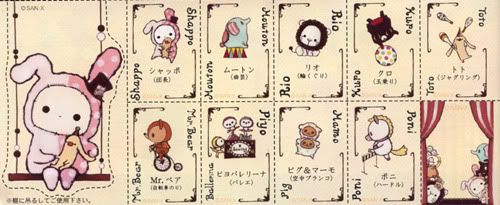
Came across this 'new-ish' character series by San-X. Really like the whole sentimental circus theme.
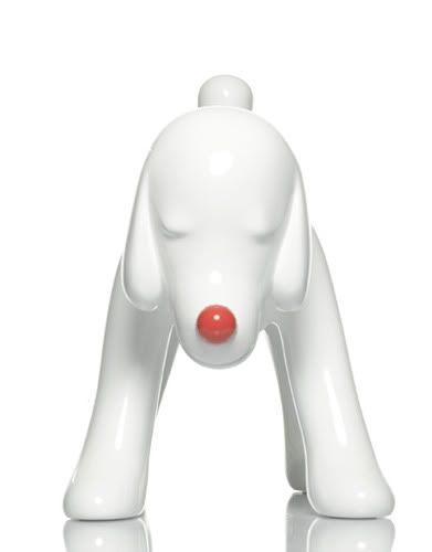
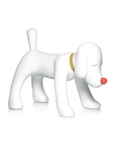
Yoshitomo Nara doggy radio!! Omg its gorgeous but I can't afford it :( If i had a job, I'd spend all my salary on this.
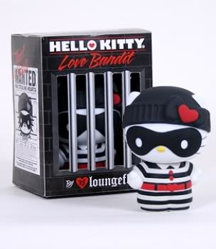
Love Bandit x Hello Kitty. Hahaha this made me smile. Was thinking of buying one, but too bad they're sold out everywhere.
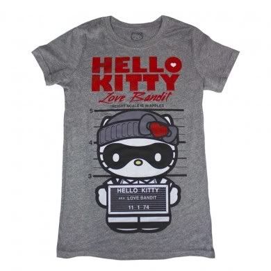
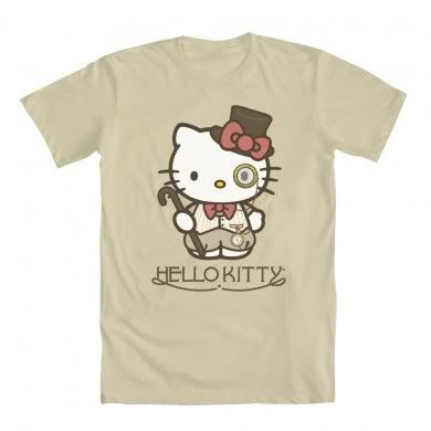


Cute Hello Kitty tshirts...but I wouldn't wear them because of the huge "HELLO KITTY" font, i think it would look way less tacky without the writing.
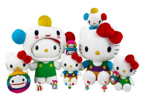
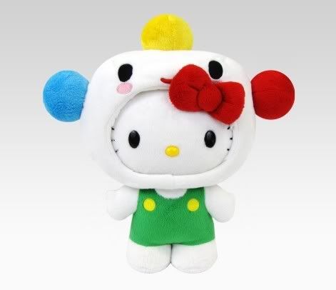
Im a big fan of FriendsWithYou so naturally I'd want to own this collab series... but im too poor at the moment.
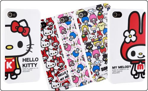
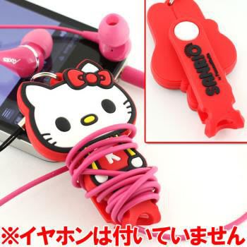
Cute Hello Kitty collab. I also have a lego headphone organizer thing, definitely makes my life easier. Sometimes I wish i had an iphone just to use all of those cute iphone cases. Hate how they never make cute cases for itouch.
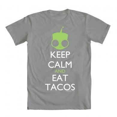
LOL wtf. I like though.
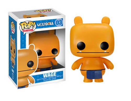
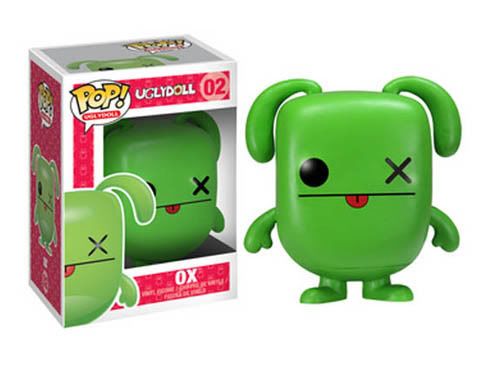
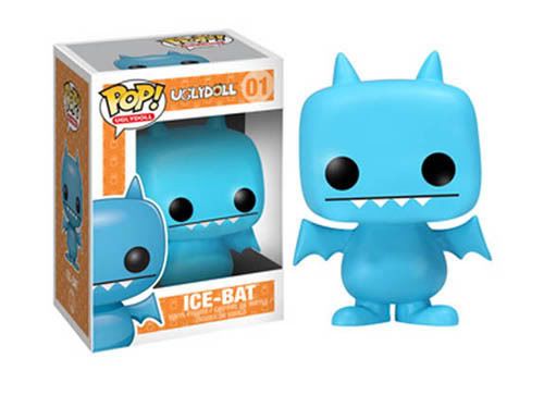
Uglydoll collab with Pop! They look verrry cute...but hopefully the paint job is worth the price they're selling it for. I remember seeing the Disney Pop! collab in stores and was extremely disappointed by bad the paint job was (and they weren't cheap either). Too obviously made in china.
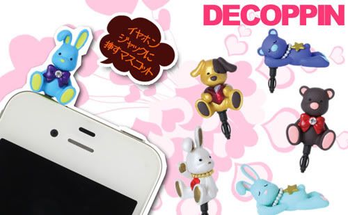
I've been seeing these on strapya a lot. They're cute little characters thing to stick on your phone's headphone jack. When I first saw them I thought they were super pointless...but I guess it makes sense if you never use your headphone jack...might as well put something cute there right?
*phew* finally done with this entry. I feel like I just grew several strands of white hair. I think its been awhile since I've typed so much in a picture-filled entry. Excuse any grammar/spelling mistakes, im lazy to recheck.


No comments:
Post a Comment