Sunday, March 25, 2012

Some inspiration

I've been very inspired by Mary Blair's work. No words needed to describe how wonderful her works are. She is, no doubt, a legend in the animation world and have influenced so many contemporary illustrators of today :) this is mainly an inspiration post for myself as I have been saving some of her works on my desktop. Im planning to collect some of her illustrated books and study more vintage illustrations (golden collection books sure brings back some good ol' childhood memories).


Photobucket

Photobucket

Photobucket

Photobucket

Photobucket

Photobucket

Photobucket

Photobucket

Photobucket

Photobucket

Photobucket

Photobucket

Photobucket


Before spring break started, I promised myself I will start designing characters and hopefully, finish another character line up in a completely different style. Im thinking of doing a set for each style; iconic, simple, broad, and realistic...but god knows how long that will take me. Im probably going to base my designs on a story because I don't want to waste time writing a completely new story. A few I have in mind are Pinocchio, Little Mermaid, Red Riding Hood, Alice in Wonderland...and the one im most excited about, Journey to the West! Journey to the West is definitely a story I grew up with. I think it would be extremely fun to design a series of characters in a game-art/realistic style. Im still in search for other stories cause some of the ones I listed above are a bit too common.


Photobucket

Just a quick sketch to ease my guilt because I've been lazing around the entire week since break started. Playing around with shapes, size, and proportions...left was first attempt, right was improved version.


Photobucket

Progress shot (lips and nose still needs to be colored as well).
Honestly...I don't know where this piece is headed. I've never done this kind of digital painting and im trying hard to not rely on references. Im struggling a lot with this piece, but I know this is just the first step. I have to keep reminding myself that I can't expect everything to turn on perfect on the first try. I struggled with the skin tone the most and im still not satisfied with it (but ignore the neck color cause I still need to work on it). I accepted the challenge earlier, so I will continue working in this style until I master it (...someday...some year...some lifetime)

Photobucket

Its not a big difference (actually it is if you look closely), but I fixed my lighting a bit right before I had to turn it in. For some reason, I couldn't get the shadow under the toolbox wheels =/ ...no idea.

I have a folder full of toys and other cute junks I've been saving to blog. Im lazy to resize and upload everything ...so maybe later. I kind of miss blogging about toys and posting random useless pictures...thinking about it, I only have one week until spring break is over :( time sure flies.

Sunday, March 18, 2012

DONE.

This has never happened before...


Its Sunday, 8:21 pm, and I've actually finished ALL three of my final projects due tomorrow. It feels so unrealistic that its actually driving me a bit paranoid... like what if I completely missed something and suddenly remembers it in the middle of the night?

And so I will blog to ease my paranoia...

The first project I finished was my long essay for environmental science, along with bullet points for my group presentation. Second project was a VERY time-consuming and frustrating lighting and texturing assignment. Third was my character sculpt for character design course. My character design class is on Thursday, but I didn't know that the actual final was going to be on Monday. So that meant I would have three finals on the same day... and needless to say, I had a mini heart attack moment. So I sacrificed all my 9gag, facebook, youtube, and partial sleep time to make sure I can get everything done by deadline. I spent four days straight just texturing (and going to class on the days I have class), basically my schedule was something like this- sleep, eat, texture, sleep, eat, texture, sleep, eat, texture. Well, this is how I work on most of my school projects on a daily basis...along with some procrastinating (no life), but these four days were especially painful because I was having the worse neck and back pain EVER but I could not allow myself to walk away from the computer.

So anyway, I've never been more thankful for my proficient photoshop skills until I started UV texturing in PS. I've been using photoshop since I was in 7th grade, but I didn't learn to use it the professional way until a year ago. Being proficient in PS helped me work so much faster in UV texturing that I had to give myself a pat on the back. If I wasn't familiar with PS, I would have the most painfully frustrating time texturing because it required so much masking, adjusting levels, clipping masks, crazy organization, etc. etc. Im happy to say I actually really enjoyed the texturing part because I could work at ease. Whenever im working in Maya, I have this major paranoia of something not working right. This happens to me all the time...I've wasted so many hours dealing with glitches and things not working the way its supposed to. Whenever the instructor goes through it in class im like, "I got this!" ...but when I do it on my own, something goes wrong. UV texturing requires 'painting' the textures on in photoshop...very fun process if you enjoy using photoshop.


Photobucket

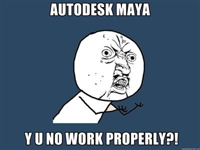
In the midst of lots of hair pulling and rock throwing at the monitor, I had to make myself a Y U NO meme to vent my frustrations.


Anywhoo.


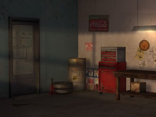
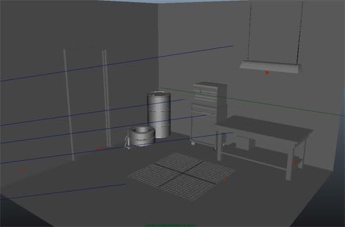
Since UV unwrapping is the first step ...here is the before picture (again)

Photobucket


And then *drumroll*


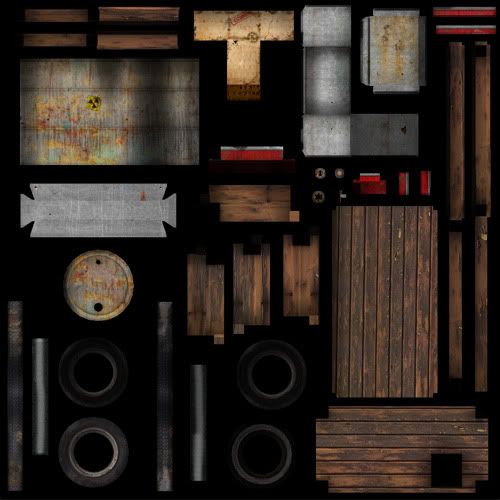
The after! (after around 2-3 days of work)

Photobucket

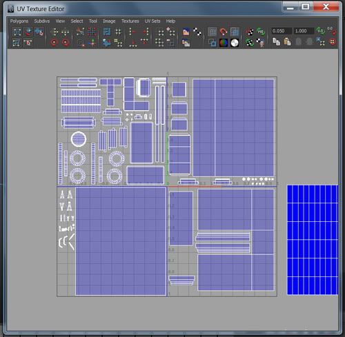
Ignore blue area. Okay, definitely not the best UV unwrap ever. I wasted quite a lot of space, but by that time I was just plain tired of UV unwrapping.

Photobucket

Painted UVs diffuse with ambient map! I ended up with many folders and a tonnn of layers. To be honest, I don't have the habit of naming every single one of my layers, but my instructor required every layer to be named (professionals should work this way).

Photobucket

Photobucket

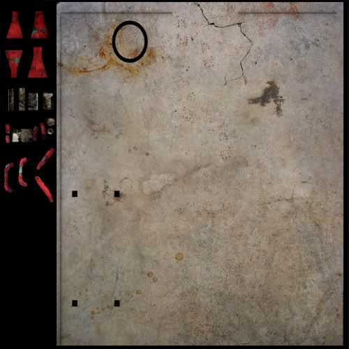
This garage floor mainly consists of texture photos i've collected from my own garage at home. Our garage floor is full of scratches, dusts, grimes ...etc. you name it.

Photobucket

Photobucket

So every UV (i had a total of four sets) must include a specular, ambient, diffuse, and bump map. The specular map is basically the 'shiny' part of the object. White= shiny, black= nonshiny. Bump map basically 'bumps' the texture and makes it slightly 3d (so it sticks out), white= areas that stick out, black= areas that doesn't stick out.

Photobucket

I didn't really understand the difference between the specular and the diffuse until I actually worked on this project.


Photobucket

The finished! Textures, bumps, speculars, and lighting.

Photobucket

Photobucket

Photobucket

Photobucket

Im not very good with dynamic lighting, my lighting often comes out very soft for some reason. Maybe im just scared to add high contrast?


Photobucket

Blank model (models were given by instructor)
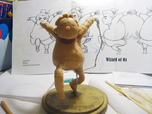


Photobucket

Sculpting progress

Photobucket

This is what I 'finished' ...but when I brought it to class, my instructor gave me a lot of amazing suggestions so I could make it look more professional.

Photobucket

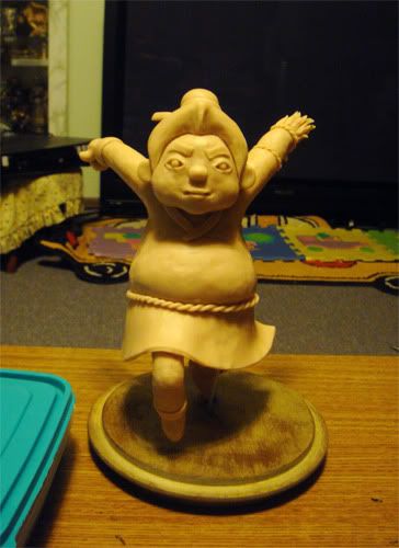
I swear its a lot smoother in real life, I took this under very uneven lighting :( I wish I could retake these. Yeah, no eyeballs. I think I might add some later (but then i gotta retake all these pictures...If you compare this to my previous picture, the previous version might appear to be better looking. But I assure you, it is because of the lighting. The hair looks less like a wig, the cheeks are less wonky, he looks less like an old lady, the sculpture overall looks more like its sculpted than built with random pieces. I could've made it a lot smoother, but I didn't have the right kind of alcohol at home =/

This is bothering me. I think im going to retake pictures tomorrow.

Photobucket

Photobucket

Photobucket

Photobucket

Photobucket

360 view.


Photobucket

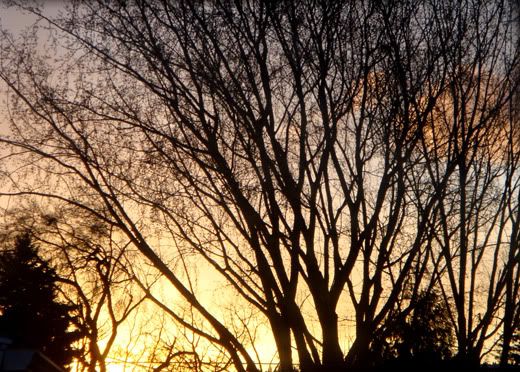
To end post. This is what I see whenever I look outside my window during sunset, I thought the pattern was beautiful so I just had to snap a photo. In fact, this tree was the inspiration for one of my paintings that won the local women's scholarship.

Friday, March 9, 2012

Character line-ups!

Finally completed my characters for my redesign of Wizard of Oz, style referenced from Mulan! Now its time to sculpt one of my characters :) I will sculpting the scarecrow child, although I wish I'd chosen the puppy instead. I didn't finalize my pet design until much later so it was too late. Oh well, i'll be taking a character sculpting class next term anyways so I have plenty of chances to sculpt another character.


I'll start with a refresh on what I came up with during the first week of character designing course. This is a quick 'shape' sketch to figure out what the basic shapes of your characters are.


Photobucket

Following some character archetypes. Triangles= villain, Round=harmless character, Square=dependable, etc. These are not rules to character designing, but our instructor wanted us to try it out.


Final designs done in illustrator (sorry kind of hard to see because its sized down by a lot). Click to see enlarged size which is still kinda hard to see.


Had to line it up 'lunch box' style (what you would expect to see on a lunch box or teeshirt). Unfortunately, I had to flip a bunch of them to make it fit right, the boy ended up looking quite awkward. Definitely not the best lunchbox line up ever...and excuse the bad cropping.


Characters are copyrighted by me, please don't steal them :(

Photobucket

Fat Hay the Scarecrow child (my sister called me racist HAHA...totally not my intention).

Photobucket

Toto the half-robot dog.

Photobucket
iTin40 the tinman

Photobucket

Dory the time-traveler /scientist.

Photobucket

Dragon Witch of the West

Photobucket

Leon the lion of the mountains.

Honestly, im quite happy with the way they turned out. My reference style was Mulan and X-men, but for half of the term I didn't pay attention to those references at all...and it really screwed me over. Most of my character designs turned out really bad, but thanks to all the critiques and suggestions, I finally grasped a clear image of how I wanted my characters to look. I had to simplify a lot of my original ideas/designs which I was hesitant to do, but then I realized that I could achieve an even stronger design without all the unnecessary details. Just by changing my lines and adding natural curves so everything flowed made a great difference. Also, taking the time to really study the style of Disney's Mulan definitely helped. I redesigned all of my characters for the final line up, cleaned them up in illustrator (which was a pain cause I could've saved myself HOURS if i'd just cleaned it up by hand). Definitely learned a lot about lines, gestures, shapes, etc etc. This course really changed my perspective on drawing/designing characters.


Photobucket

A really creepy-ish picture of my sculpture progress. Just finished building his body with foil and wires, now its time to put clay over and sculpt it in all the details. SO EXCITED!