I'll start with a refresh on what I came up with during the first week of character designing course. This is a quick 'shape' sketch to figure out what the basic shapes of your characters are.
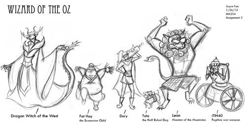
Following some character archetypes. Triangles= villain, Round=harmless character, Square=dependable, etc. These are not rules to character designing, but our instructor wanted us to try it out.
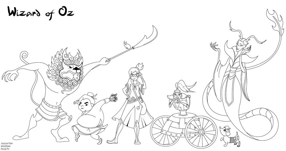
Final designs done in illustrator (sorry kind of hard to see because its sized down by a lot). Click to see enlarged size which is still kinda hard to see.
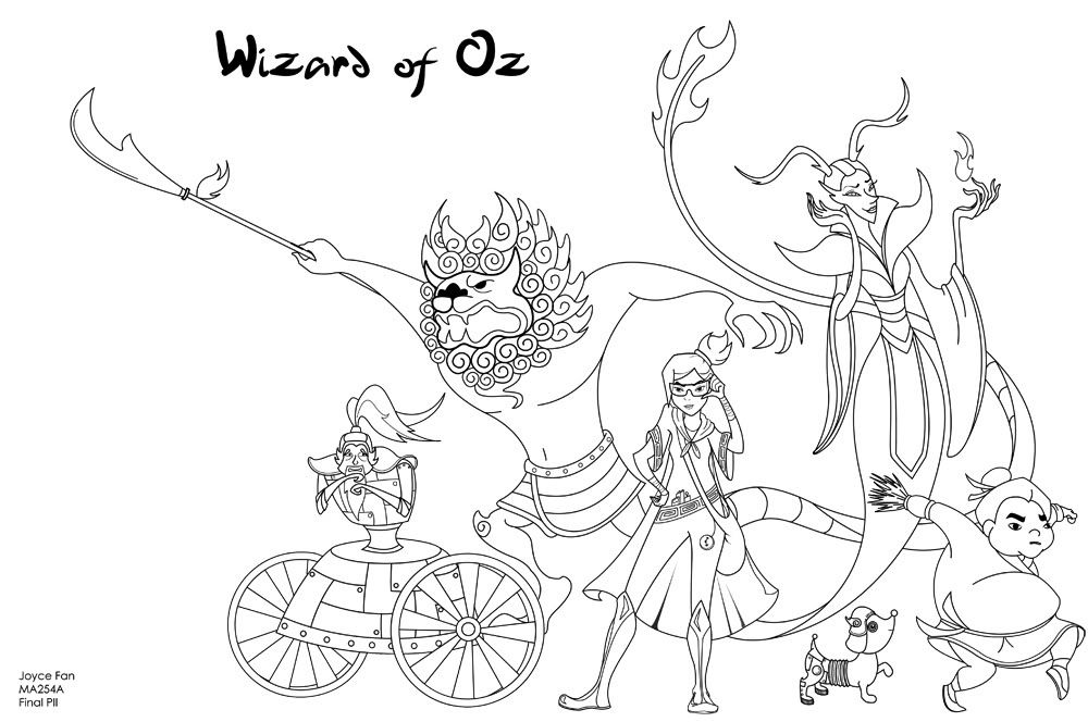
Had to line it up 'lunch box' style (what you would expect to see on a lunch box or teeshirt). Unfortunately, I had to flip a bunch of them to make it fit right, the boy ended up looking quite awkward. Definitely not the best lunchbox line up ever...and excuse the bad cropping.
Characters are copyrighted by me, please don't steal them :(
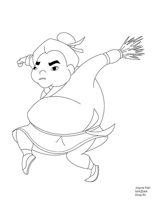
Fat Hay the Scarecrow child (my sister called me racist HAHA...totally not my intention).
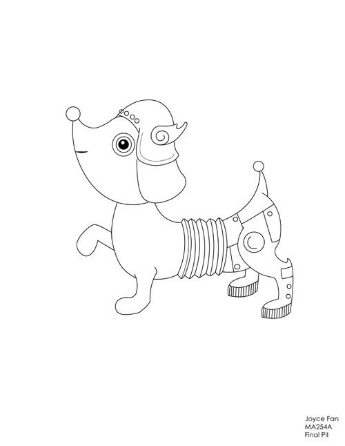
Toto the half-robot dog.
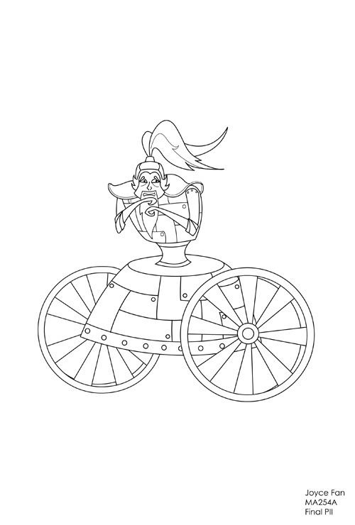
iTin40 the tinman
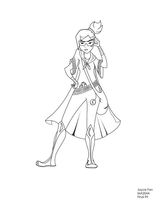
Dory the time-traveler /scientist.
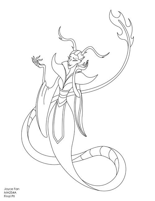
Dragon Witch of the West
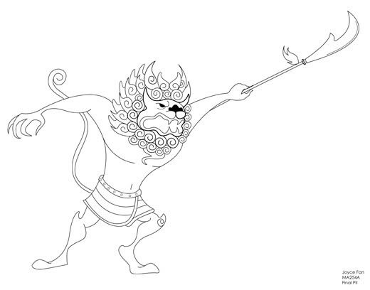
Leon the lion of the mountains.
Honestly, im quite happy with the way they turned out. My reference style was Mulan and X-men, but for half of the term I didn't pay attention to those references at all...and it really screwed me over. Most of my character designs turned out really bad, but thanks to all the critiques and suggestions, I finally grasped a clear image of how I wanted my characters to look. I had to simplify a lot of my original ideas/designs which I was hesitant to do, but then I realized that I could achieve an even stronger design without all the unnecessary details. Just by changing my lines and adding natural curves so everything flowed made a great difference. Also, taking the time to really study the style of Disney's Mulan definitely helped. I redesigned all of my characters for the final line up, cleaned them up in illustrator (which was a pain cause I could've saved myself HOURS if i'd just cleaned it up by hand). Definitely learned a lot about lines, gestures, shapes, etc etc. This course really changed my perspective on drawing/designing characters.

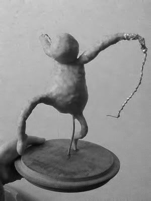
A really creepy-ish picture of my sculpture progress. Just finished building his body with foil and wires, now its time to put clay over and sculpt it in all the details. SO EXCITED!

No comments:
Post a Comment